The designers of theme parks divide the amusement facilities into two categories: one is parades and performance shows that make people feel satisfied, and the other is mobile games that directly stimulate the prefrontal cortex.
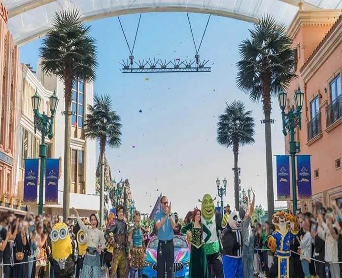
In fact, the performance show is also a visual stimulus. Like other visual settings in the theme park, it uses simulated scenes to convey stories, so that tourists can use the information they receive to match the knowledge reserves in their brains to create a pleasant experience. Therefore, the performance show should let visitors know what scenes and stories they are in as soon as they enter the show, even if the show has not yet started.
But the essence of mobile games is to experience acceleration. According to the requirements of China Special Equipment Bureau, large-scale amusement facilities are divided into ten categories, namely, sightseeing vehicles, taxiing vehicles, overhead sightseeing vehicles, and gyroscopes. Their movement characteristics are concentrated on rotating around the axis, sliding, lifting or falling freely. For example, the roller coaster, which allows the human body to experience the acceleration in six directions through diving, vertical falling, parabolic movement and other designs, is the epitome of such facilities. These high or low accelerations stimulate the prefrontal cortex, which is responsible for perception and psychology of the brain, so that people can produce pleasure through speed and “fear” under the protection of security, and can’t help but harvest happiness. However, one of the key points of the amusement facilities, or the whole theme park, is to let tourists have emotional ups and downs. “Experience comes from change,” Liu Daohong said. “Tourists will get used to it when they are in the same state all the time, and they will have a better experience if they keep changing.” Therefore, there is always a gloomy area in a happy and bright amusement park, or when you play rapids, you always have to go into a dark cave – these are all to regulate your mood.

Which direction will you go after entering the park gate? Some studies believe that most people’s subconscious always prefer to walk counterclockwise from right to left. But if everyone follows this preference, it is easy to create congestion. Taking Disney as an example, the theme area of tomorrow’s world will always be on the right side of the entrance, which is to prevent congestion – the theme representing the concept of “future” will be placed on the right side of the entrance, suggesting that tourists can visit again last. In this way, tourists may fight with the subconscious, and some choose to travel clockwise from left to right. When placing new projects that are easy to attract people, Disney will also choose to place them on the diagonal position of the previous new project. This way people will not gather in the same place. In order to do this better, most parks will adopt a circular layout. One of Disney’s design preferences is center radiation, that is, taking the castle as the center, and each main passage in the park points to the center. This makes people not worried about getting lost, but more willing to explore various places (and shops) of the park.
No matter how much the park spends to isolate the interference of the real factors outside the park, there will always be some elements in the park to make tourists come back to reality. For example, when they are in a hurry, they cannot find the toilet, or when they see the staff pushing through the trash can, it will also make people play in a second. So the toilet layout also learned. The Discussion on Humanized Design of Public Toilets in Scenic Spots points out that when people have a sense of urgency, the time they can tolerate is about 7-15 minutes, and the distribution of public toilets in the park should be based on this. In order to take care of the needs of children and the elderly, this distance needs to be shorter. At present, Chinese experts generally believe that the radiation radius of public toilets in scenic spots should be 200 meters to 500 meters. Some parks are designed to allow children to walk within 5 minutes.
The garbage, goods and props depend on the underground. Tokyo Disneyland has dug three tunnels, three meters high, six meters wide and three or four hundred meters long, to let employees carry food and props through them. On the ground, the cleaning personnel should also take care of the scale with tourists. In Disney, the cleaners must keep a distance of more than 15 meters from tourists when cleaning. If a child with popcorn is encountered, the cleaner will follow him at a leisurely pace. Once the popcorn falls to the ground, he will immediately run to pick it up and take it away.
Amusement park design is a huge project. Universal Studios Beijing, which was officially opened less than a year ago, has determined its investment plan as early as 2001. It took 20 years from intention to landing; As for investment, let’s put it this way. The initial investment of Tokyo Disneyland increased from 100 billion yen to 180 billion yen in 1983. Liu Daohong introduced that it generally takes four years for him to design an amusement park, the first two years for design and the second two years for construction. His team has 400 members from cognitive neuroscience, architecture, landscape design, psychology and other disciplines, which does not include the outsourcing companies responsible for terrain, water conservancy and other related designs. If you add them all together, the design team of a theme park has as many as 1100 people.

